Friday, January 30, 2009

Wil Lindsay: Breathprints


Went to an opening at Payne Gallery last night during class called Re-generate, Re-image, Re-focus: New Directions in Photography and I was really impressed with these prints in the show. I would recommend that if you're in Bethlehem to check it out.

Damian Aquiles


Love the rich color palette and textures. via ssc

Wednesday, January 28, 2009

Assignment 3: Greendreamlawntreecare.com mock-up


SELF-EVALUATION I created this mock-up to serve as an informative landing place for my brother's landscaping business. I approached it from the perspective of what new or prospective customers would want to see and learn about the business. Overall I think that the look and feel is clean, modern, and young. I created three options for the layout and believe that the top one is the strongest.

Tuesday, January 27, 2009

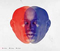
Vin Diagram


vindiagram
Originally uploaded by iambarefoot
I've been working on a report that features several venn diagrams...This just made me laugh.

Monday, January 26, 2009

Sunday, January 25, 2009

Assignment 2: Print to Web


TRANSLATION OF ABOVE PRINT POSTER


SELF-EVALUATION The poster had to be re-set using browser safe fonts, however I believe it's just as plausible to typeset the poster in the original Swiss face and slice the entire page up. However, updating "image" based typography would pose to be more work than it's worth, especially when information is likely to change as on the web. Overall I think the solution, still makes the information easy to read and maintains the original impact of the imagery.


Thursday, January 22, 2009

Assignment 1: Web Site Critique


In the interest in gaining greater understanding of elements of web page design that I admire and would like to emulate possibly for the final project, I have selected the following sites for consideration and review. I feel the overall presentation of each of the following sites are strong in terms of pleasing aesthetics, use of typography, white space and ease with which the content can be absorbed.

1) book cover archive
OVERALL PRESENTATION– This website is the newer of the two sites I have posted here that function as a visual archive and gallery for book cover designs. The stylized page title in the header is well executed in a clean, classic vintage type treatment. The careful consideration of the type on the site and use of rules fits the “printed” subject of this sites content.
USABILITY–
As a gallery the grided layout of the books allows the reader to quickly absorb the contents of an entire page easily. The top navigation features an icon that takes the user back to the “front” home page as they navigate through the pages. A drop down menu of categories allows the user to filter their viewing experience with ease. External page links are highlighted or underlined with rollovers. Images use standard alt tags and copy can be easily scanned and read because of appropriate type styling and hierarchy.
ORGANIZATION–
Clean, simple and unobtrusive layout with great use of white space (padding) and rules to seperate out content sections.

2) covers
OVERALL PRESENTATION– This website is the older of the two sites I have posted here that function as a visual archive and gallery for book cover designs. I’m drawn to the clean, simplicity of this three column layout. The neutral gray background helps the cover art to pop off the page.
USABILITY–
In comparison to the book cover archive site, the left hand column page navigation is simple and easy to use and understand. It would be nice if the search button was on the same page. The overall usability is just as effective as the book cover archive site.
ORGANIZATION–
Clean, simple and unobtrusive three column layout with great use of white space.


3) design21
OVERALL PRESENTATION– Design21 is rich with unique content. It’s a social and information driven site with a compelling mix of subject matter and features a slideshow on the home page. The information is presented in clearly delineated sections and clean institutional look and feel.
USABILITY–
The navigation is color coded and calls the user to action. Some of the button are a little small and can be easy to miss. However as a social network the interaction is top-notch.
ORGANIZATION–
Clean, simple and unobtrusive three column layout with tabbed filtering of center content area.


4) design can change
OVERALL PRESENTATION– This is a highly interactive flash-based experience. The content is presented with strong dominating visuals. The entire page area changes as the user navigates the content. Great use of photography, color, type and information graphics.
USABILITY–
As a flash-based site, this poses a bit of a disadvantage if the user doesn't have the latest plug-in. However, the slick bottom bar navigation and left and right page scrolling makes it a fun and memorable user experience which will certainly drawn the audience in.
ORGANIZATION–
Clean, simple and unobtrusive drop down bottom fixed menu.


5) magcloud
OVERALL PRESENTATION– The content and very white page layout makes this site attractive and unique. The rollover with caption cover browsing home page presentation is simple yet impactful.
USABILITY–
The very vertical (scrolling) page and simple two column layout makes the information easy to scan.
ORGANIZATION–
Simple browsing, searching and single page scanning of information.


6) monocle
OVERALL PRESENTATION– The web counterpart to the print magazine is succinctly branded.
USABILITY–
The iconic sectioning is brilliantly applied from the print piece to effectively navigate the site. Although, I don't completely agree with knocked out body copy for reading, the magazine has kept the copy to a minimum and replaced the written editorial with engaging video stories for a rich user experience. When you click to strictly magazine content, the pages go to white for readability.
ORGANIZATION–
Nice use of space, simple browsing, searching and single page scanning of information with simple drop down menus and horizontal rule division.


7) uppercase
OVERALL PRESENTATION– This is a e-commerce site with a nicely adapted "gallery" look and feel that is whimsical, modern and fresh.
USABILITY– This site utilizes a simple single-page like experience where you can view details of products within a pop-up frame that greys out the background. The user can also sort or find similar content by "tags" which are shown in the left column of the page or view the entire inventory of the store through the drop down menus.
ORGANIZATION– Nice use of space, simple browsing, searching and single page scanning of information with simple drop down menus with a simple color palatte.

8) whitehouse
OVERALL PRESENTATION– A new president in the oval office has brought a fresh, elegant, modern and standards compliant website to life! Features engaging slideshows, video and a blog.
USABILITY– This is the first site that I have review with a specific accessibility page which shows it's commitment to usability and the user experience no matter what their disabilities may be. This site strives to be not only a great public face of the administration but also a wonderful learning tool for students and citizens alike.
ORGANIZATION– Nice use of space, simple browsing, searching and single page scanning of information with simple drop down menus with a complete site menu links featured in the footer.

9) julie bayard
OVERALL PRESENTATION– This is the personal portfolio of French designer Julie Bayard. It features a uniquely patterned gallery layout that is organic and striking. The pieces load "building" before your eyes. The viewer also has the ability to move the entire configuration around on the page as well as highlight and enlarge each thumbnail individually.
USABILITY– Once again since this is a flash-based site, there are some limitations. However, as a showcase of Julie's work it is simple and engaging. The layout is similar to a timeline and moves horizontally instead of vertically (within the widow) thus creating a different experience for the user.
ORGANIZATION– Simple and beautiful.

10) full single
OVERALL PRESENTATION– This site is a collection of user submitted sites that features single page websites which are standards compliant.The simple content follows it's function. The thumbnails are links to the showcased sites and user can scroll through the entire collection page by page only. As a web designer this should be a great place to find layout inspiration.
USABILITY– As with other gallery like sites, this one is so simple that it lacks any filtering, searching, user feedback or detail information on the collection. It's built similar to a portal which just takes you to other sites.
ORGANIZATION– Simple and clean.


A Brand New Day


Nate Williams is one of my favorite illustrators.

Wednesday, January 21, 2009

Inspiring Words


Created with Wordle using copy from President Barack Obama's inauguration speech.

Tuesday, January 20, 2009

I got a blog!

So what's up world, I'm officially blogging...This is for an evening class that I'm taking on interactive design!